Windows superstar Raymond Chen has provided explanations for a couple of the Windows XP user interface oddities that I wrote about previously. See Exhibit A: The Welcome Screen and Exhibit D: Notepad. In the meantime, I've found three more exhibits.
Exhibit I: Semi-Transparent Icons
- A lot of the icons in Windows XP are strangely semi-transparent. They look pretty but don't support the metaphors they represent. When was the last time you saw a Notepad with a clear cover, or a folder with a see-through flap?
Exhibit J: Taskbar and Start Menu Properties
- The property sheet for the Windows Taskbar and Start menu has always featured a cool little graphic for illustrating what the various options do. Unfortunately in Windows XP Microsoft forgot to update the graphic from the beta (presumably) to reflect a design change in the shipping code. Notice the difference between the chevrons in the circular button that hides or shows the notification area icons:
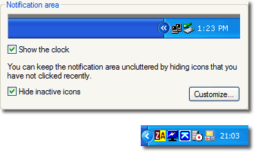 |
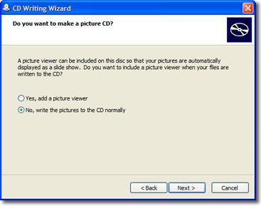
Exhibit K: Picture Viewer
- This is actually a positive exhibit that I thought I'd include to prove that Microsoft did get a lot of things right. I was archiving some photographs to CD-R using Windows XP's built-in burning functionality—it's convenient and I didn't need anything more sophisticated—when the wizard helpfully asked me if I wanted to include a picture viewer on the disc:
 |
Comments
There are 6 comments on this post. Comments are closed.
I've said it before and I'll say it again... Man you're picky! Well spotted.
For what it's worth, I do posess a notepad with a transparent front cover... It happens to be green rather than blue, and the binding is down the side rather than the front, but otherwise it's not so very different from the one in the icon.
Nice points again. Concerning the taskbar properties window (Exhibit J), I'd like to see the example taskbar and start menu look like whatever theme I may have installed at the time so that it truly represents what I might see when I apply whatever changes in the property window.
Want to know what I really hate about XP and even W2K? The icons in administrative tools! They are very windows 95ish for some reason in a land of glossy notebooks.
I agree with Josh, there are still lots of old icons in Windows Xp that ruin the whole luna-ish experience :)
Yes, hopefully Windows Longhorn will be much more consistent.